
AlgoStudio
A technical identity with an approachable voice.
01 / THE BRIEF
A clearer identity for learning to code.
AlgoStudio brings coding challenges, programming assignments, and hands-on learning into an education platform. I worked with the brand on a visual identity that could communicate its technical focus while remaining approachable to educators and students.
The challenge was to give the platform a recognizable visual language: modern enough for a programming product, but clear and welcoming enough for a learning environment.
02 / THE MARK
Code, simplified into a brand mark.
The symbol combines a slash, a closing-tag shape, and the letter A. These familiar programming references are abstracted into a compact, angular mark rather than used as a literal code illustration.
The construction gives the symbol a clear silhouette that can stand alone or sit beside the AlgoStudio wordmark. The identity presentation includes a construction grid and spacing rules, helping the lockup remain consistent across applications.

03 / THE VISUAL SYSTEM
A focused palette and a practical typeface.
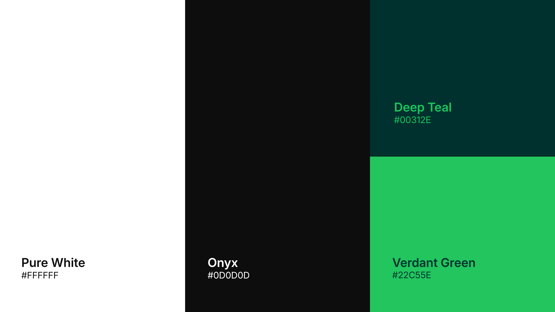
Verdant green provides the main accent, supported by deep teal, onyx, and white. The combination gives the identity both bright and restrained settings: a strong green-led expression for prominent applications and quieter backgrounds for the wordmark.
Inter supports the visual system with a direct, readable typographic voice. Light, dark, and green logo treatments show how the same identity can adapt to different backgrounds without changing its core form.
04 / APPLICATION
One identity across different settings.
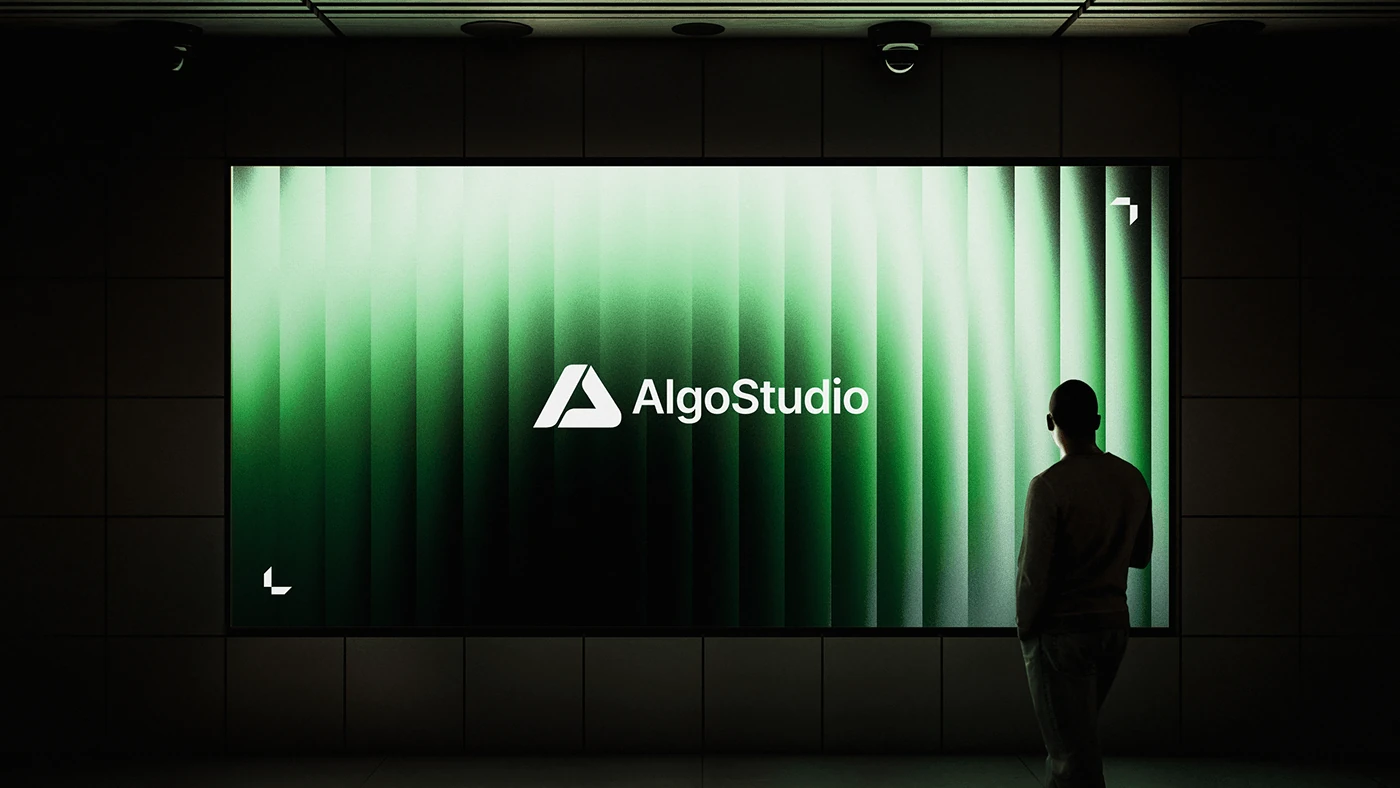
The application work explores how the mark, color, and wordmark function together at a larger scale. The green cover presentation shows the identity as a complete composition, with the mark kept prominent and the surrounding visual treatment supporting it.
This case study focuses on the delivered visual identity and its design logic. Application mockups illustrate the system; they do not imply that every pictured placement was produced or installed.