
CCTC
One visual system for an esports tournament.
01 / THE CLIENT & CHALLENGE
A tournament with many places to show up.
Sweat’s Den brought me on to lead the graphics for Chandni Chowk to China, a Call of Duty: Mobile esports tournament. The client work covered the event identity, campaign graphics, and broadcast materials.
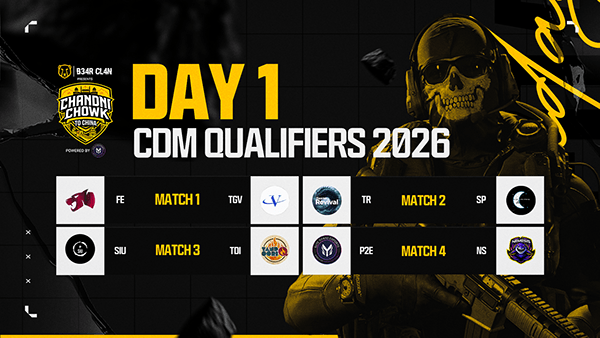
Schedules, player matchups, standings, thumbnails, and live-stream screens each have different information to communicate. They needed a shared visual language so viewers could recognize the event from one format to the next.
02 / THE IDENTITY SYSTEM
A bold emblem with a shared visual language.
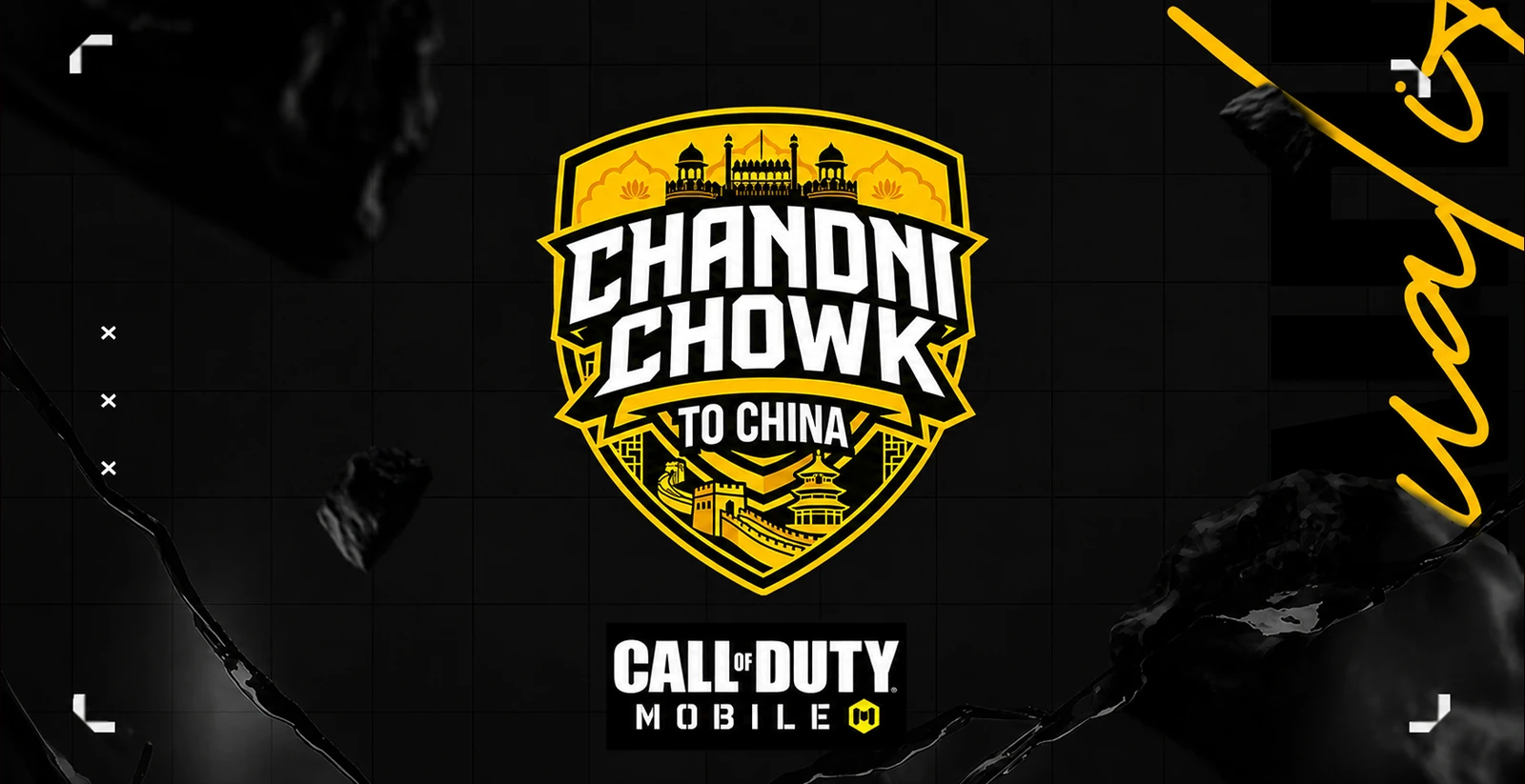
The crest places the tournament name at its centre, framed by architectural references to India and China. Yellow, black, and white establish the palette, while a grid, angular corners, and textured backgrounds carry the system into supporting graphics.
Hitmarker handles the main display headlines and Inter keeps schedules, dates, teams, and scores readable. The distinction lets promotional pieces feel energetic while practical information remains clear.
03 / THE CAMPAIGN
The same identity, different information.
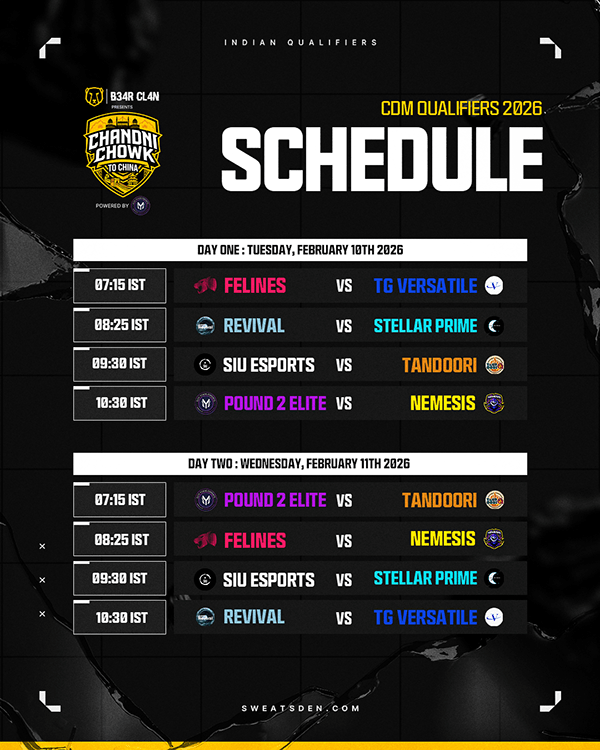
The campaign graphics include event-format announcements, schedules, talent features, matchups, qualification posts, and leaderboard layouts. Each format gives priority to its own information while retaining the crest, typography, and visual framing.
Player photography and team colours introduce variation where needed. The event system holds those changing details together across the campaign.
04 / THE BROADCAST
Designed around the live event.
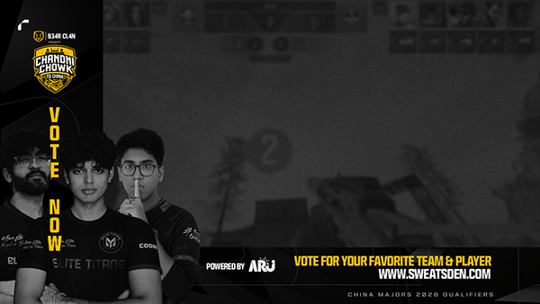
Starting-soon and be-right-back screens, timeout graphics, media-day layouts, and information screens use the same event language in the broadcast. Thumbnail and social formats extend it beyond the stream.
Together, the completed graphics demonstrate how one identity can serve promotion, live coverage, and ongoing event information without treating each asset as a separate design.
05 / THE RESULT
A consistent system across event touchpoints.
The project brought the crest, type, colour, and framing together across the event identity, campaign, and broadcast set. The cover is a presentation mockup; it does not imply that a physical placement was produced. No audience or performance results are claimed.